“A Neat & Clean Website”🤌

Brekrr is a networking & dating app.
In this case study, I will explain the process behind the design of its landing page.
The client’s emphasis was on highlighting the networking aspect.
Before we get into the case study, let’s do a quick website walkthrough.
Okies, let’s start with the hero section.

As you can see the hero section primarily features text on the left, accompanied by a user review on the right.
Let’s start with the left part first:
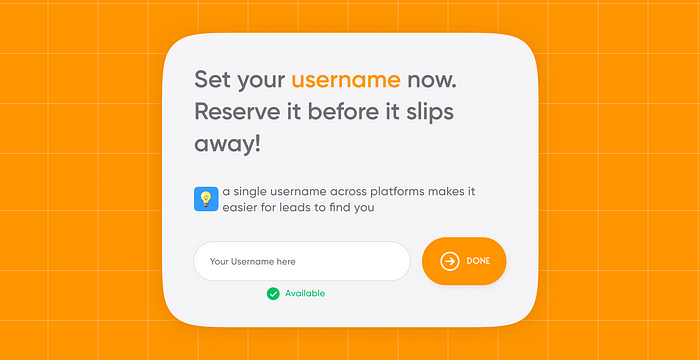
Basically, I’m letting the user fix his/her username right away even before downloading the app! Yes, you heard that right :)
Here’s the thing I’ve noticed:
More and more people are opting for the same username across all their social platforms. why tho?
- Personal Branding/ Cool Factor: It’s undeniably cool to say, “Hey, I’m sanjayreddy571, catch me everywhere!”
- Easy Spotting: People can effortlessly find you, and you become the go-to contact, accessible and ready for a chat.

46 people responded to the poll in a Whatsapp community( avg. age of participants is 25Y)
“Would you prefer having the same username across all your social handles?”
- 38 said Yes
- 2 said No
- 6 said Mostly yes
So, if you consider this sample, ~96% are willing to use the same username.
Alright, imagine this — you’re signing up on a new platform. Wouldn’t you want to give your existing Insta username a try first?
So, guess what? We’re catering to precisely that audience — making sure your username is your online identity.
let’s say you are not really specific about the user name, even then I’m trying to persuade you by saying “ a single username…(see the image)”
Now you’ve entered your username and clicked on ‘Done’, that’s it, right? Well, not quite. The moment you click ‘Done’, this card pops up.
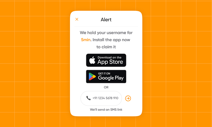
Just when you think you’ve got it, I’m asking you to download the app within the next 5 minutes to secure your username. Sneaky, right?
Here’s the thing: I’m betting that a lot of users would take the plunge and download the app, considering:
- they’re already a step into the process
- & wouldn’t want to miss out on claiming their username.
Let’s say someone is still not interested, then the moment they close the alert, a timer pops up, displaying the remaining time of those 5 minutes.

It’s like a nudge to speed up the user. There’s also a CTA in place.
If the user still doesn’t take any action, after the 5 minutes have elapsed, that username is released and becomes available for everyone.
So that was my process for the text part of the hero section.
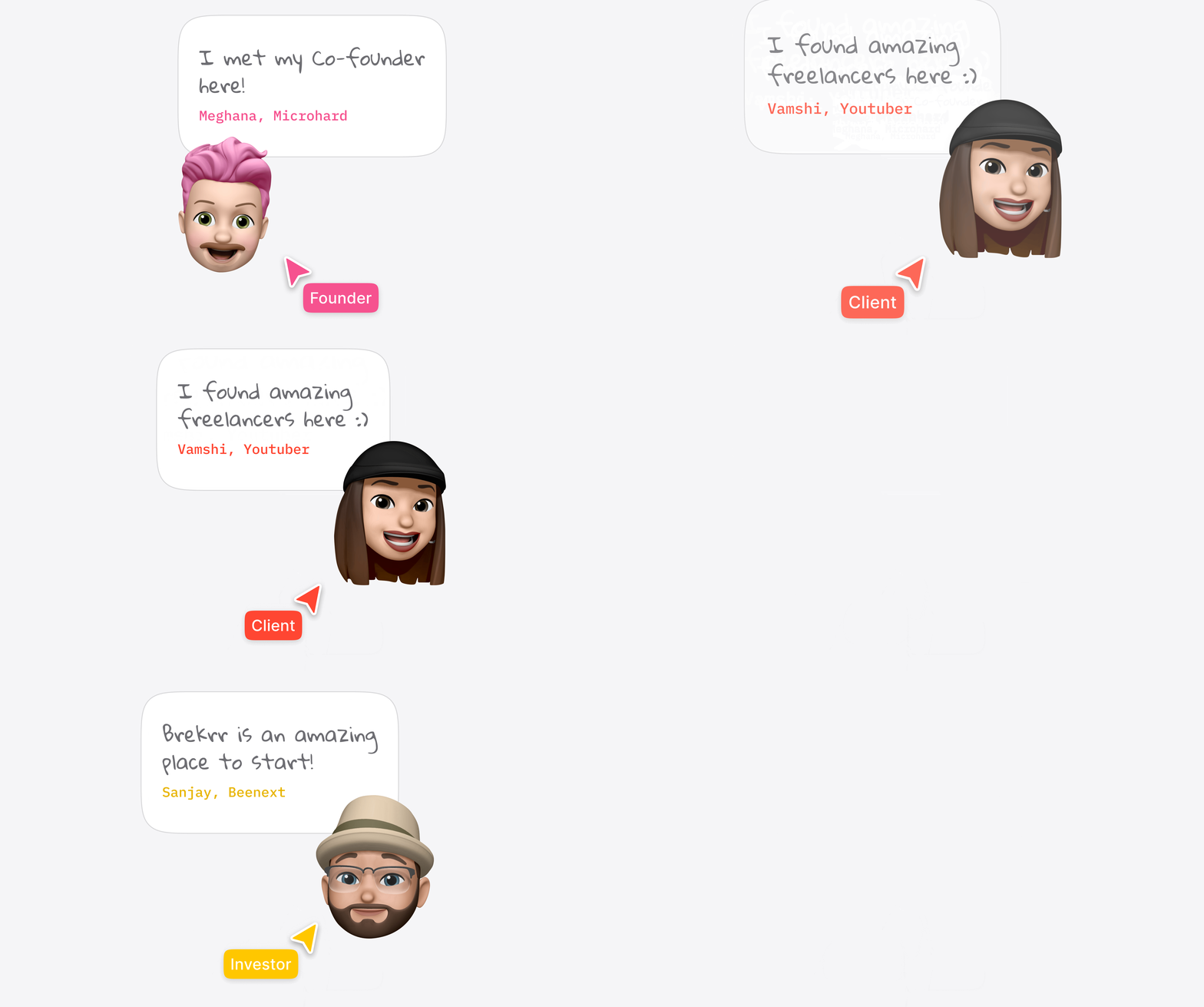
Now, on the right, you can see a testimonial(actually a bunch of ‘em).
Traditionally, people often rely on illustrations to depict the app’s features. However, I intentionally avoided that approach for a couple of reasons:
- It’s become overly common and lacks novelty.
- I wanted to maintain a sense of intrigue by not revealing all the information in the hero section itself.
This choice aligns with the fact that users typically don’t stay on the hero section, as scrolling down comes naturally.
Thus, there’s no need to overwhelm them with all the information right at the outset.
I’ve categorized users into three distinct personas:
- Clients
- Founders
- Investors
Imagine you’re a startup founder, and you see an investor reviewing this app, doesn’t that make you more likely to download it?

Since this app is backed by T-Hub, I figured why not give it a shoutout on the website?
That’s where the top bar comes into play — it slides down after a few seconds, just to make sure you don’t miss it.
The logo displayed on the website isn’t actually mine, these are a few logos that I designed:

The concept was to feature a contemporary cupid.


A few other logos that I made:

I tried combining a heart and a tie.

Here I tried showing a bulb in the shape of a heart. It ended up looking really weird (-_-)
After consulting with the client, I implemented a few changes, resulting in the final version of the hero section:

In the new hero section,
- Download CTAs are now prominently displayed.
- Emphasized the aspect of ‘networking’ while keeping the details under wraps.
- The user reviews have also been rearranged for balance.
But I identified a few issues in the current hero section:
- Excessive white space.
- Merely mentioning ‘Networking’ felt too abstract.
- While the emojis were cute, they didn’t quite align with the professional website vibe.
And here’s the updated hero section:

This design appears more immersive, doesn’t it?
okies, back to the case study. As you scroll down you come across this slide.
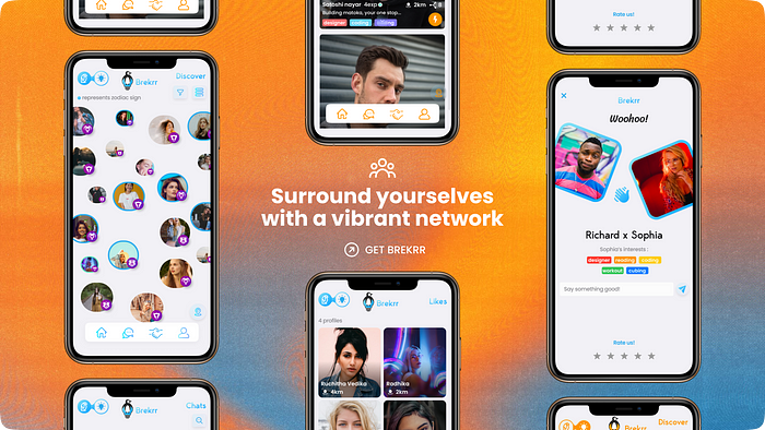
- The slides take up the entire screen, adding an immersive touch.
- My aim was to create an authentic product launch experience, which is why I’ve incorporated all these mockups.
- The mockups are strategically positioned around the text, symbolically conveying their meaning.
Scroll a lil more & these 2 amazing cards show up on your screen:
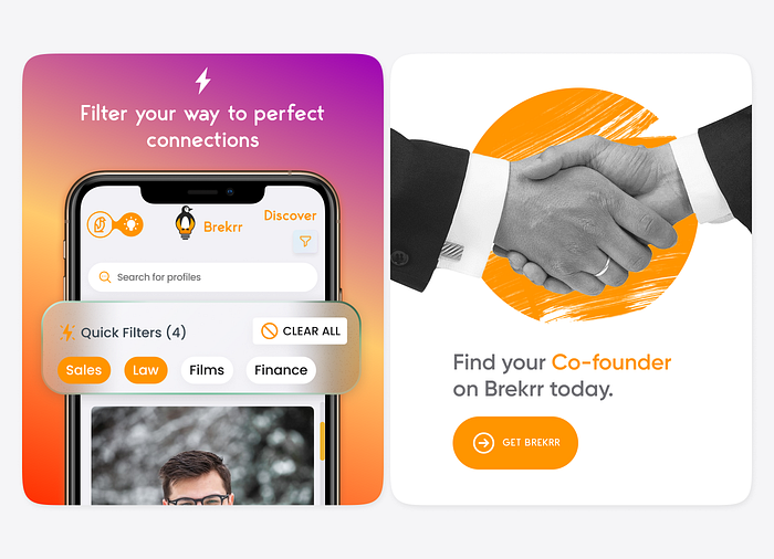
When multiple elements coexist within a single frame, establishing a visual hierarchy becomes crucial to direct the user’s focus.
- By positioning one card to the left, it’s more likely to catch the user’s eye, given our reading pattern from left to right.
- A gradient fill for one card and a plain black and white background for the other, to deliberately create visual contrast.
Indeed, there’s a deliberate pattern at play here.
The card on the left takes the role of explaining an app feature while also working to establish trust with the user.
On the flip side, the card on the right capitalizes on this built trust by presenting a compelling Call to Action (CTA).
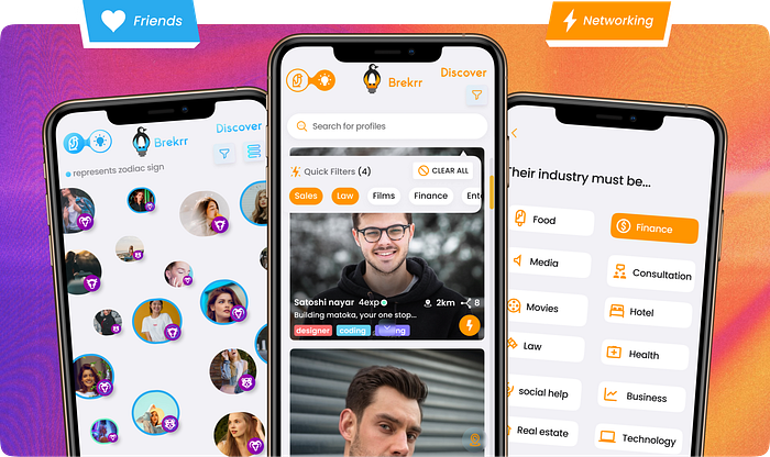
The app serves a dual purpose: dating and networking.
One approach is to take a paragraph of text to explain it, but I wanted to convey it visually( since people on the internet don’t read lengthy texts) and so a slide.
For dating the primary color is blue, for networking primary color is orange.

This theme is consistent throughout:
with gradients, high-resolution mockups, and glass morphism on one side. against contemporary collage-style art on the other.
This blend is tailored to resonate with our target audience, those aged between 16 and 26.
Here I’m explaining another feature ‘Chat’ and on the right, it’s just another abstract hook.
A lil more scroll, and voila! You’re greeted with this playful slide.
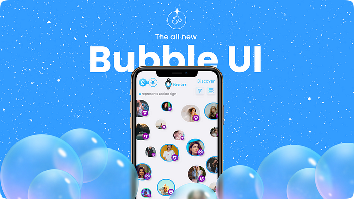
Most dating apps in the market have a traditional UI with profiles displayed in rectangular boxes and one needs to swipe thru ‘em.
But we wanted to stand out with a new interface.
profiles are presented as smol smol adorable bubbles.
Yet, recognizing the familiarity of the boxy UI, we haven’t done away with it entirely.
That’s why we’ve given you the freedom to toggle between these two UI modes.
In this slide, I’ve opted for a single mockup to ensure a focused and undistracted visual experience.
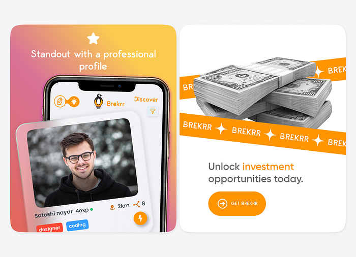
Once again, the cards come into play.
As you may notice, I intentionally disrupt the visual pattern periodically, encouraging continuous scrolling.

Following every pair of cards, there comes a big-ass “I take over the entire screen” kinda slide.
Imagine: if I just stacked up all those cards, it would undoubtedly feel monotonous. So, I’m throwing in these screen-dominating slides to keep things sizzling.
All the groundwork we’ve covered so far is all about building trust. Simple.
But let’s say you’re still scrolling aimlessly without hitting that download button, it’s time to get into the real stuff i.e. benefits.

Let’s see ’em now:

First, I tried showing three reasons why you must use Brekrr. But I didn’t really like the way it looked. So I tried a few other orientations:


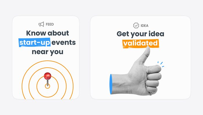


I was just having some fun experimenting with this bento UI trend.
Now I’m assuming that you clearly know what the app has to offer you and you want to give it a try, so I’m presenting you with CTAs
Breaking down the entire process into 3 simple steps not only simplifies the process but also pumps up the onboarding rate.

As you continue scrolling down, you’ll find yourself at the bottom of the website.
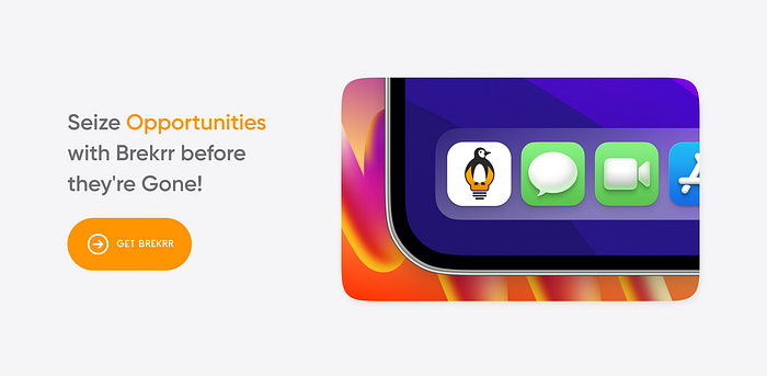
I made a few standees for marketing. These will be placed on college campuses and canteens:

The initial interaction between the user and the app takes place on the Play Store or App Store itself.
This moment is an experience in itself, and we need to ensure it feels fantastic.
That’s why I opted for simple yet attractive app store assets.
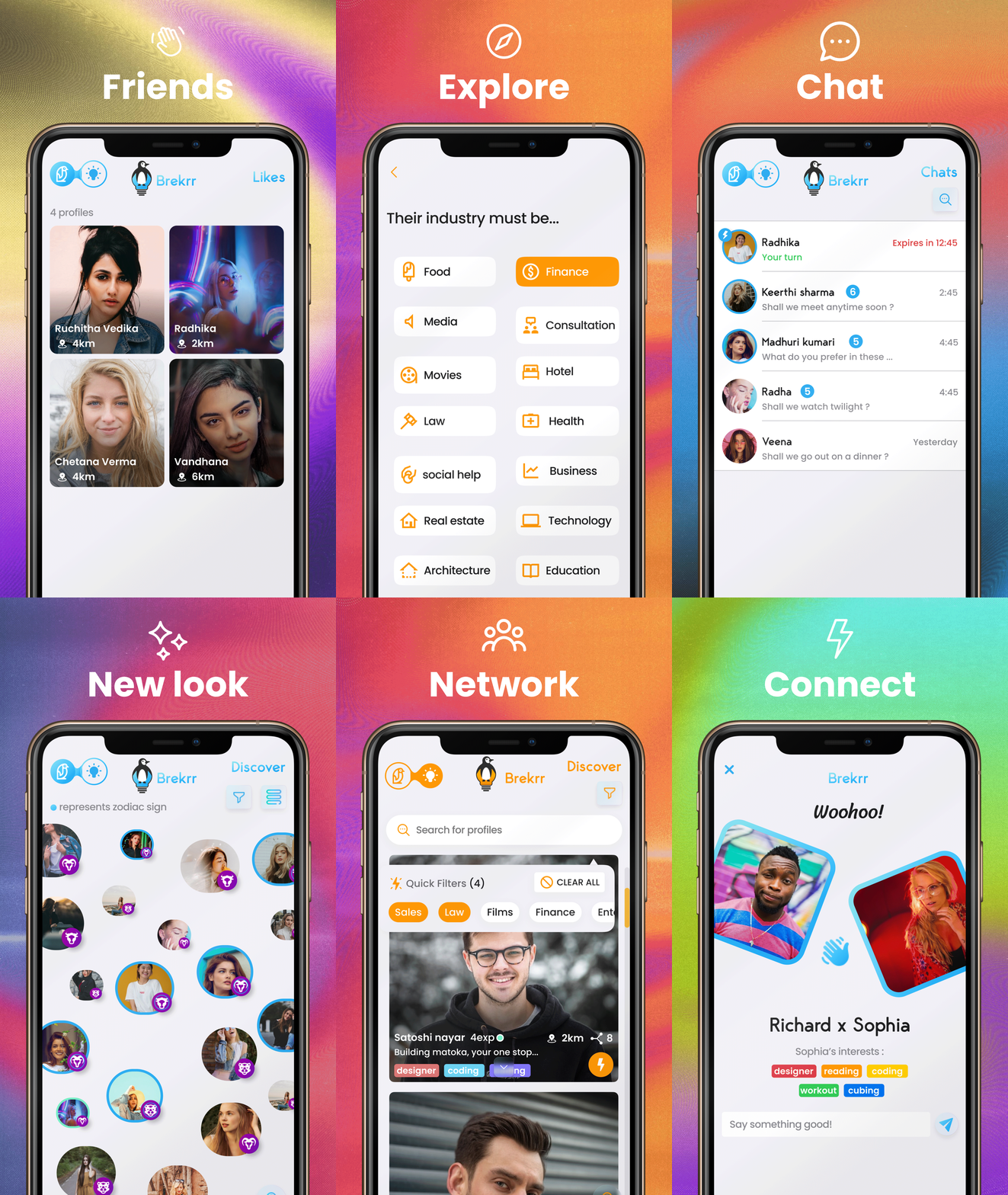
I tried a different visual theme by mixing sleek gradients with collage art. It ended up looking good, I feel. What do you think?
A few of my articles:

